PROPOSAL
I am going to be aiming my magazine at teenagers aged 16 to 19 who are in college.
My magazine is going to be about all the things that go on within the college, including any achievements students have made, deals in the college shop or canteen, and any new information like days the college is closed, or new enrichment sign-ups.
Some ideas for titles of the magazine include "College", "Achievable" and "Right Direction". I didn't really like most of these because they dont seem very interesting and I don't think many people would be attracted to buy it. I finally decided on the mast head "On Route" because it's short and snappy, and it will make people want to read it, to see what it is about. It also links to the theme of a college magazine, as it implies that it includes information to keep you on track when you are in college.
The font that I would like to use for my title is "Onyx" which is very bold and easy to read. I would also like to use this because it looks a lot like what has been used in proper magazine covers. Another font I would like to use could be "Bernard MT Condensed" because it matches with the Masthead quite well.
Some ideas for tag lines for my college magazine:- "studying your way to success"
At the beginning of every month this magazine will be published, so it will be twelve times every year. It will be used to show all the information for the rest of that month, including auditions, charity days, days off, or any other information.
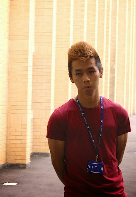
I will have an image of a student stood facing the camera, or partaking in an activity like completing coursework or socialising. It will also need to be bright, so as to catch the attention of the reader. I will get this picture by asking someone in my class, or a group of people in my class to pose for me to capture the image.
The dimensions of the cover will be that of a standard A4 sheet of paper, which is 297mm X 210mm. This is because it will be easy to carry around and easy to store when you aren't reading it. It would also be good because it will be easy to make everything fit onto the page without it being so small that you can't read it.
This is my first draft of the magazine. I like that the masthead matches to the colour of the shirt and I think I may make it an ongoing theme throughout the magazine that the clothes will be matched by the masthead. I do not like what the starbursts. I think the reason for this is because the colour doesn't really go very well with the colour of the mast head. I think I will change
 this and make a theme of dark and pale reds on the page, rather than trying to match the colour of the lanyard.
Finally, the banner on the left hand side of the page which is the left third, looks like a chat magazine, very relaxed, which is in complete contrast to how the rest of the magazine looks. I am going to change this by possibly taking away the backing colour and just have it as words. If I do this I will need to change the font colour because it will not be able to be seen against the light background.
Having made the changes I mentioned above I am much happier with the result. I have deleted the banner on the left hand side and changed the font colour to a colour that suits the theme of the rep shirt. I also applied this theme to the starburst and lower banner. This helped to make the bold words stand out a lot more.
For my contents page, I will continue the colour theme of dark reds and pink. I would also include images that are relevant to the cover lines that I have used on my front page.
To improve this I would make the background a little bit more interesting. I would do this by maybe putting different shapes or shading onto the background, nothing too big as it would detract the attention from the main content of this page. I would need to learn how to change transparency of shapes within InDesign because I don't yet know how to do this and the shapes will need to be more transparent because you still need to be able to read the text.
Courtyard cafe Image- http://lasvegaspizzeria.com/wp-content/themes/Gourmet/thumb.php?src=http://lasvegaspizzeria.com/wp-content/uploads/2011/11/CURLY-FRIES.jpg&w=590&zc=1&q=80&bid=1
Studying Image- http://gradschooljournal.com/wp-content/uploads/2013/02/mooc.jpg
Theatre image- http://blog.mixonline.com/briefingroom/2010/12/17/
Stationary image- http://www.indiamart.com/orion-overseas-exports/stationery-items.html


Great intital work - well done.
ReplyDelete