Thursday, 23 January 2014
Creation of Front Page

I have placed an image of Selena Gomez, where I will be
putting my real images in later to organize my tag-lines and advertisements.
I have used a large pink font for the mast head to make it eye-catching, and it
is pink to attract the correct target audience.

Here you can see that I have inserted an image of a bubble and changed the colour slightly to make it seem more girly.


 Here you can see I have made the background a lilac colour that I will be continuing throughout the magazine I have also changed it by importing the image I will be using for my final cover. It was cropped around so that the head partly covered the masthead as I said before. Where it had been cropped it wasn't very neat so I outlined it with white to make it look more stylish and purposeful. Finally, I added in a banner to the bottom and linked the colour with what the model was wearing and the masthead.
 Next you can clearly see that I have added in more images and added a title of 'amazeballs posters' advertising posters inside the magazine using colloquial language that the readers will hopefully relate to and be enticed to read it. I also added an advertisement for a free makeup bag to attract attention to the magazine. The banner at the bottom is now blue and had a bar code in the bottom right hand corner.
 Next I have changed some of the colours so that they are brighter and stand out more. I have also added more taglines to the left third and introduced a banner which is advertising the double page spread. This is in bright pinks, blues and yellows to attract the attention of my target audience.

Once my review had been completed, I needed to change a lot on this page. The colours were too bright and it was difficult to read the mast head because of how I had edited the photograph onto it. In response to this I made all of the colours lighter into pastel colours, and I changed the layout so that the font just slightly covered the top of the models head, this meant that it was easy to read and you could still see the models face and eyes clearly. I made the top banner smaller so that I had more room to show off the mast head and the model.


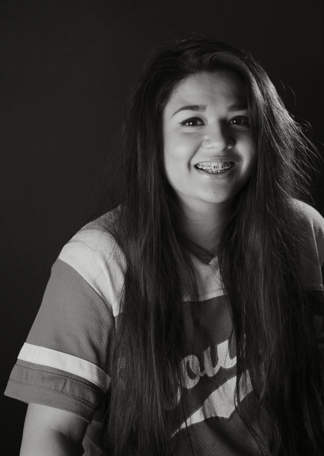
Possible Front Page Images


Subscribe to:
Posts (Atom)